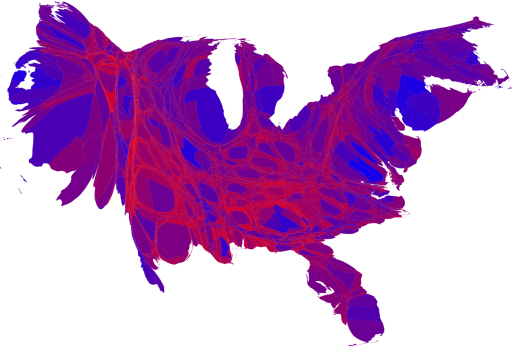
 Election maps, of course. The New York Times has an interactive map, while Mark Newman plays with cartograms, a map redrawn with both population and geography in mind.
(h/t to Andrew Sullivan and Matthew Yglesias for the tips.)
Election maps, of course. The New York Times has an interactive map, while Mark Newman plays with cartograms, a map redrawn with both population and geography in mind.
No comments:
Post a Comment